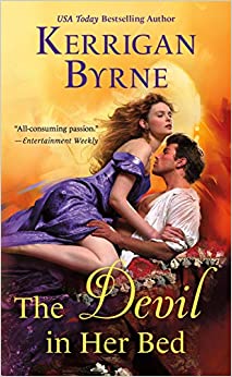
The Devil in Her Bed
The Devil in Her Bed is an extremely disappointing finale to Byrne’s Devil You Know series, this instalment focusing on a vengeful countess and the man she believes killed her family.
Pippa Hargrave is an impassioned adolescent who loves and yet is envious of Francesca Cavendish, her best friend. Francesca, you see, is adored by Declan Chandler, the foundling boy whom Pippa has a crush on, and they all live on the same country estate. But something much worse and more serious than childish jealousies soon invade Pippa’s life, when a bunch of Americans invade and slaughter Francesca, Francesca’s twin brother, parents, all the animals, then set the estate on fire. Only Pippa, Declan and one of the maids survive. She encourages Pippa to pose as Francesca and claim her title and inheritance, then use the money to pursue the villains.
Years later, the Mont Claire Massacre has passed into gristly history. Now living as the scandalous Countess of Mont Claire, Francesca Cavendish – (i.e, Pippa, but I’ll refer to her as Francesca, as that’s how she’s mostly referred to in the book) is a woman on a mission. She’s is in pursuit of the men who killed the Cavendishes, men presumed to be members of the Crimson Council, a secret society with some ugly secrets. Francesca’s dream is to kill them all. But she needs an ally to accomplish that goal, and she finally finds him in The Devil of Dorset.
Francesca doesn’t recognize her childhood best friend and crush Declan in the devilish assassin. And he doesn’t recognize in her the perfect, idealized mental image of Pippa, who was like a sister to him and whose ‘loss’ has haunted him for years. Will they be able to team up and find the murderers?
Well, of course they will. But The Devil in Her Bed is the worst Byrne I’ve read – soapy, melodramatic, filled with abused and tortured children and men (and childish men). One of the biggest stumbling blocks here is Declan’s inability to combine his feelings for Pippa and those for Francesca. He worshipped Pippa; he desires this new Francesca and had a crush on the younger version, and is unable to differentiate between his memories of his now-grown friend. He is devastated when he learns Pippa is Francesca, and his Madonna/whore complex is annoying – but he’s otherwise the usual Byrne hero, complete with childhood trauma.
Francesca is the usual shades of feisty and strong, and I generally liked her – she’s the only reason this book doesn’t get an F. She does have absurd and irritating thoughts like “I just licked Christmas” (apparently Declan’s skin “smells like Christmas” so… burnt fruitcake and roast potatoes)?
Other reasons for this book’s D rating – as if the aforementioned melodrama, and confused hero isn’t enough? Byrne actually drags out that hoariest of clichés, the gay man who is an irredeemable and massively evil sociopath – who also happens to be the hero’s biological father. Sweet God, didn’t we leave this nightmarish garbage in romance’s primordial swamp with Steve and Ginny? Sure, there’s brief mention of a kind lover who saved said father’s life, but Good Gravy – it’s a stereotype, and not a good look in this day and age. Throw that on to the pile of the gloomy, gloopy melodrama of the plot and you end up with a turkey. (And not the Christmassy kind!)
I’ve said before that Byrne seems to have lost control of her voice, which have always been distinctive. She’s talented enough to be able to write dark romances without leaning into clichés or fully giving into them. But lately those clichés, poor plotting and unlikable characters have been winning out, and it’s an unfortunate thing to witness, because some of her other books have been breathtaking. The Devil In her Bed in general is a wholehearted disappointment, and represents a real low. Hopefully the author’s next book will see a return to form
Buy it at: Amazon, Audible, or your local independent bookstore
Visit our Amazon Storefront
Recent Comments

I gave up on Ms. Byrne after All Scot and Bothered. The hero was such a jerk – it didn’t feel like romance. It felt like a bad reality show where the whole audience is screaming “not him” and the heroine is clueless.
I feel like everything’s been headed southward for her since The Duke with the Dragon Tattoo. She’s forgotten how to leaven her narratives.
I think the rot set in some time before that – <b>The Duke</b> had some good points but a really unlikeable hero and the books after that were a law of diminishing returns. :(
Yeah, she peaked earlier in that series. It’s a pity.
I can’t say I’m surprised by this review and grade. Sadly, I think KB’s HR has been going steadily downhill for the last few years. I can’t help thinking that she wrote herself into a rut – the melodramatic, overblown style of The Highwayman hadn’t really been seen in HR for a while and it caught on, but now that’s the sort of thing she’s expected to write; she hasn’t been able to sustain the balance and has tipped over into all things purple and cheesy. She’s a good writer – but I think she’s become hemmed in by reader/publisher expectations.
And I liked her other purple, cheesy stuff! But there’s usually a certain tricky balance and tone to her writing, and that’s been missing lately.
There are, currently at the time I write this, four HR novels. Is it me or all four covers throwbacks to the 1970/80s? So off-putting, garish, cheesy, down right Barf Bag Soecials!! Except for the F’ing Dukes anthology where the cover boy looks like he rides a Harley – not a stallion. Or maybe he just rides harlots?? Personally I would find it very hard to look beyond the covers because they are worse than dear old Fabio: time has moved on but covers like these belong in a past era of cheesiness.
They do seem kinda dated right now. The current ouvre is cartoon. Do you like those better?
They might look dated – although I’m not sure that’s the word I’d use, because as things are now, they do at least mark out the books as belonging to a certain genre. That’s much harder to do with the cartoon covers – there was a comment on the review of Maybe One Day earlier this week which pointed out that the rom-com-ish cartoon cover in no way reflected the content of the book. And I’m sure we’ve had other discussions here about that, too – the blocky-bright designs work for some sorts of books and not others – but they’re in vogue right now and everyone is doing them.
And then there’s the fact that publishers are charging at least $2 more for books with cartoon covers. This book is $7.99, and the recent releases by Eva Leigh, Joanna Shupe etc. have been around the same. Put a cartoon cover on an historical romance and you’re looking at $9.99 and above – the upcoming To Have and To Hoax by Martha Waters is $11.99, Elizabeth Everett’s A Lady’s Formula for Love is $9.99, and so is Evie Dunmore’s A Rogue of One’s Own. While I’ve bemoaned the clichéd clinch cover in the past, I’m not sure the new cartoony ones are any better – but at least the clichéd clinches DO tell you what you’re likely to find between the covers of the book.
Black Sheep: Gossip, scandal and an unforgettable Regency romance eBook: Heyer, Georgette: Amazon.co.uk: Kindle Store
This is an example of my idea of a lovely cover. Cartoons – no thanks – but they are probably better than downright retro cheesy – they only reinforce the idea that some have that HR is just rubbishy, embarrassing crap suitable for those with an IQ below 0. I don’t see that the “retro” or whatever we call them covers are enticing to HR virgins. They probably remember that Mum (or even granny) read this sort of stuff in the bad old, pre-woke days and will conclude it’s definitely NOT for them. The half way house, I think, is to go for something stylish but beautiful which, given the cover above, tells you that it’s not a vampire novel, CR, fantasy, etc. but definitely HR. Oh well, rant over.
I agree with you that the retro cheesy romance cover look isn’t likely to attract new customers, but it is a trend right now in other sectors as well. For example, Burger King recently re-did their logos to look like the ones from 20 years ago because, apparently, Generation Z likes retro things. It’s so out, it’s in! While that strategy might work with a hamburger that has a somewhat decent reputation, why reinforce the bad reputation of HR by using the covers most associated with it? That sounds like the bad marketing of, “It’s not your father’s Oldsmobile.” Because then you immediately think of your father’s Oldsmobile, and we can see how that campaign ended up.
My suggestion for appealing to the next generation of HR readers would be to adopt a more streamlined look for covers. Think something more abstract with maybe just a leg showing or something that suggests naughtiness without looking too porny or cheesy romance- but not cutesy rom-com cartoon covers. Anyone else agree?
The UK editions of Hoyt’s Maiden Lane books are period appropriate – https://www.amazon.co.uk/dp/B00LFPBBRA/ref=cm_sw_r_cp_apa_JAXVDG1M8F4MY07DTNRE
The UK covers for Mary Balogh’s current series are similar to the one Elaine posted – https://www.amazon.co.uk/dp/B01FE6V5H6/ref=cm_sw_r_cp_apa_HNRPTEQ1Y63NDNB6KH6W.
They’re far less in-your-face than the standard clinch but still say “historical”.
Really like these covers . . . everyone is beautifully dressed and (if a couple) positioned as equals.
I agree that I’m not a fan of cartoon covers! However, I have to admit I’m not crazy about the cover you posted. It’s fine and doesn’t offend me, but I rarely like close-up cropped photos of a person that doesn’t include the face. I preferred the Sourcebook covers for Heyer.
https://smile.amazon.com/Black-Sheep-Regency-Romances-Book-ebook/dp/B001P5040U/ref=sr_1_1?dchild=1&keywords=black+sheep+heyer&qid=1615655098&sr=8-1
I liked those as well – but the trouble with something like that for other/more recent HR is that it could give the impression of “stuffiness”. It’s a tough one although I think the sorts of covers were used for Julia Quinn’s books over here – more line drawings than cartoons work quite well – https://www.amazon.co.uk/dp/B08T9RF6MB/ref=cm_sw_r_cp_apa_fabc_BAC20VNXC36S4ET7RK6V
All her ebooks are getting new covers – https://www.amazon.co.uk/dp/0349429790/ref=cm_sw_r_cp_apa_fabc_65ZR8TS1Y6NNR57XZC9F?_encoding=UTF8&psc=1
https://www.amazon.co.uk/dp/B01N9E9D2F/ref=cm_sw_r_cp_apa_NSBHVPF3P794JT5CMEVT
I can see that about the stuffiness. But those last two covers of the Quinn book! :-P My personal quirk, I know, but I don’t like cropped torso photos! LOL!
I live in the US but bought some of the UK versions of Balogh’s Survivor series because I thought the covers were so much better, e.g. “The Proposal”, which in the UK has a woman in period dress but in the US has a man with a period inaccurate shirt open to his waist.
And in a time when men’s shirts did not button up the front but were were put on over the head. Oh well…….
Exactly. Those covers make me wonder if the hero’s shirt is torn all the way down to his navel.
Or lower (tee hee)!!
For me, seeing a face on the cover can, subliminally, affect how I visualise the characters in the story though I try to swerve this. Or, often the cover portrayal is so totally unlike the author’s own descriptions that I just get annoyed and shake my head in disbelief. Covers are such a huge marketing tool and I get that authors may have no say but what drives the decisons behind the choices? The four covers I referred to in my first post I find both.ludicrous and, frankly, insulting to my taste and intelligence.
The covers I like the most are the ones for Mary Jo Putney’s or Mary Balogh’s novels, where you can tell right away it’s a historical romance, but no one’s clothes are falling off. There’s a dreaminess and a dignity to some of those covers that just appeals to me.
Then again, maybe this is out of style and I’m being old-fashioned?
On the subject of HR covers with no clothes falling off, I think Harlequin has been making some really stunning covers lately. That last update they did across the line of having a color coded rhombus in the upper-left hand corner looks bold and modern without feeling anachronistic to the point of distraction. Their older logos look a bit dated in comparison.
Harlequin could do a better job about not having “designer stubble,” as Caz calls it, on the male HR models. Also, some of their compositions look a bit wonky. But the covers that look good really nail it. I’m partial to the ones that aren’t too zoomed in and show just the hero or heroine in a sort of three-quarter turn. Some of the ones where the models are zoomed in and looking right out at the reader can look a bit intense and overbearing like they’re saying, “You WILL read this!”
Carina Press also makes some covers I really like, but they could put a little more effort into their HR designs. Of their historical catalog, I think “Her Lady’s Honor,” “Dalliances & Devotions,” and “Appetites & Vices” look the best.
The covers of Harlequin’s Desire line are really spectacular: sexy but classy, with women wearing lovely gowns and statement jewelry, while the men are usually wearing tuxes or suits (sometimes with the jacket removed). The color palettes are soothing and the design and composition are top-notch. Plus, the HD line features ethnically-diverse characters and this is reflected in the cover models. Here’s the cover of Reese Ryan’s WAKING UP MARRIED which I think highlights all the best elements of the Harlequin Desire cover design:
https://www.amazon.com/Waking-Up-Married-friends-Brothers-ebook/dp/B08GM6X989/ref=mp_s_a_1_3?dchild=1&keywords=reese+ryan+bourbon+brothers+series&qid=1615671826&sprefix=reese+ryan&sr=8-3
Ooh! That’s a nice cover. I saw that when it came out and was impressed.
You’re definitely right about Desire’s cover designs. They really capture the glamor that the line promises. Confession time: I’ve only read one Desire that I recall, Temporary Wife Temptation, but I immediately get a positive feel for the rest of the line’s focus just based on the covers: wealth, style, classy seduction, and so forth.
I know you enjoy the Presents line, so what do you think about their cover remodel? It looks somewhat different from a lot of the other lines but is aesthetically pleasing. That arch that the characters are under gives it a kind of fairy tale look, which I think was a good call given the line’s promises.
As for the soon-to-be-defunct Dare line, most of the covers scream “Fifty Shades of Grey knockoff” to me. Add to that the complaints I read that Harlequin probably tried to straddle both the kink and wholesome markets, and I can see why they’re on their way out. Let’s hope Harlequin comes up with a steamy replacement line that isn’t simultaneously trying to capture a trend while still pretending to be innocent. I know you’ve recommended Blaze in the past. Maybe they’ll revive it!
I like HP covers—but I’d almost describe them as “Harlequin Desire lite” in that they are far more airbrushed and illustrated looking. As for the Dare line, I don’t think it ever found its footing—as you say, they tried to straddle the line between dark/kink and “girl-next-door having sexy times.” Plus, while Harlequin Presents may be described as “an occasional sex scene will interrupt the angsty heartache,” Dare could best be described as “an occasional twinge of existential angst will interrupt the non-stop sexytimes”—and I just feel that it takes a good writer to be able to string that line out to book length (Caitlin Crews and Jackie Ashenden wrote some good stuff for Dare, but Clare Connelly—who writes wonderful HPs—just couldn’t sustain the amount of sex scenes Dare required and her Dare books were by and large tedious).
ITA. I wrote earlier that I thought the cover of Bronwyn Scott’s latest book was stunning. Both models were clothed and it was a photo, which helped show the different fabric textures and colors and hair/skin tones. That, plus the way the models leaned into each other (she was on his lap), made it very sensual and appealing. I noticed that other Harlequin Historicals have also had appealing covers – someone in the design department is definitely earning his/her pay.
Yes! Portrait of a Forbidden Love demonstrates how it is possible for a cover to look sexy, sensual, tasteful, lush, and historical all at once. I am looking at it now and also notice the story-appropriate details of having a jar full of paintbrushes and a window that appears to be the style one might see in an atelier instead of some random, generic location that has nothing to do with the book.
I think Revealing the True Miss Stansfield, the next book in Bronwyn Scott’s miniseries, is another stunning cover. It’s really the only example I can think of a romance novel cover showing a heroine painting. And that’s kind of odd considering how painting- while usually not a profession for ladies- was considered a part of a well-rounded woman’s education along with embroidery, nature studies, and other “feminine” pursuits. Maybe we’ll see a trend of cover art depicting HR heroines in historically accurate pursuits.
And, of course, it would be great to see these historically activities within the pages themselves. Caz and I often bemoan on AAR how too many authors make their titled HR heroines do a bunch of anachronistic stuff just so they’re doing something. But titled women did do things in the past. True, their options were limited, but that didn’t mean they sat around doing absolutely nothing all day. Sorry, tangent over…
Yes, Harlequin has had some lovely covers. Refreshing.
This works for me as well!
Sorry, I’m going off topic here, but since you mentioned one of my favorite things to complain about…
I’ve noticed some big price increases for ebooks this year. For example, I had planned to read Patricia Veryan’s Sanguinet series this year. This series was written over 30 years ago. The author is dead. There’s not a good reason for the publisher (in my mind at least) to price these like a new release, and I doubt demand is driving the price. When the books were selling at $7.99 a piece I had planned to buy one a month to spread out the cost of purchasing the series. Now that St. Martin’s has raised the price to $11.99, I’ve abandoned my goal to buy and read them.
I do wonder whether these higher prices are going to authors or whether they’re going publishers.
I wonder that, too. Cynical me says the publishers are getting it – AND it must be cheaper to employ a graphic artist than a photograper, studio, make-up artists etc.
Wow – that’s… quite a hike. The prices in the UK are a bit more reasonable – between £5 and £6 – although I don’t think all her books are available digitally here.
I actually like these covers – and find them more enjoyable than the cartoon illos we’ve had lately.
Couldn’t agree more Elaine!
I commented pretty negatively about the latest Joanna Shupe cover a few days ago which is not unlike this one. I’m tired of covers that depict characters having sex and scream “nothing more than lady/mommy porn here”. I’m not a prude and enjoy well-written scenes of physical intimacy. But these covers are a huge reason romances in general are so poorly regarded IMHO, and it irritates the crap out of me that the industry continues to create this kind of art for their titles.
It’s like the publishers want to have their cake and eat it too: on the one hand they are happy to produce titles that keep the beast fed (we voracious romance readers) and their pockets lined; but they really don’t think much of our taste in reading material so they put the nasty on the cover to make sure anyone who sees a person reading this knows just how low-brow that person’s reading tastes are.
I’m more than a little sick of their judgement TBH.
A bit of biting the hand that feeds you. Romance is the biggest tranche of publishing output generating billions yet we readers exist to be insulted, denigrated and generally despised for our choices. Grrrrr……..
And sadly, it doesn’t only seem to be the publishers who are thinking that way. I’ve come across a few romance authors who don’t seem to like the genre very much judging from some of the things I’ve seen on SM. It’s things like that that remind me that only a small proportion of the romance readership is actually active on SM – if more readers realised how they’re viewed by some of the authors they love,they might not be able to make a living.
SM, Caz? Sorry, don’t know what it is. Please advise. Ta.
Sorry – SM = social media.
Blushes……..
I don’t know what “SM” is either, but I might be able to offer some insight about romance authors who don’t seem to like the genre very much. On Reddit’s eroticauthors group, there is a running joke called “write a f****** romance novel!” Basically, the consensus is that there is only so much money that can be earned by churning out erotica shorts whereas the real money is in romance. So a number of erotica authors are using their shorts as a training ground for the more lucrative genre of romance.
In defense of the forum, I will say that a lot of commenters who write, “I don’t like romance, but I’ll crank some out to make money” get jumped on by posters who are like, “Dude, you are in for a rude awakening if you think you are going to sneer at romance readers and write a book that doesn’t hit the beats they’re looking for. They will tear you a new one. It’s not the same forgiving market as erotica. These people have specific expectations and standards.”
The sad thing is, I see both sides of this. If writers could make it big in any other genre, they would probably be writing that instead. Like I originally set out to do, would-be writers see the dollar signs in romance that few other genres offer on such a large, seemingly limitless scale. Considering how hard it is to make a living as a writer, I can totally understand this kind of heartless literary prostitution.
On the other hand, having becoming a romance reader convert, I can see the passion so many writers put into their work and not just for the money. I also see communities like AAR who genuinely love the genre and don’t want to see it treated so dismissively by writers strictly chasing the big bucks.
As for me, I gave up my meanspirited dream to write a “hack” romance novel long ago, because I learned that the genre is nothing of the kind. Knowing what I know now, I wouldn’t even trust myself to write a half-way decent romance!
I feel as though a lot of current romance isn’t very aspirational. There is an odd sneering at the idea that love, in and of itself, is a valid goal.
Could you elaborate on this, Dabney? As a romance writer, I’m curious.