![]()
Committee Chair Linda Hurst

![]()
The Worst Cover category is one that continues to be somewhat controversial. Some voters chose not to cast a vote in this category because it just seemed “mean” to them, or because they couldn’t participate in any worst contest at all. One author whom last year criticized us for including such a category had a change of heart this year. Perhaps to put pressure on her publisher, she actively encouraged her readers to vote for her cover in this category. On the other hand, there were several readers who wished they could vote for all the covers. Many voters consider this category one of the highlights of the contest. Their reactions ranged from laughter (because they couldn’t believe covers could be this bad) to outrage (because they had read and loved the book with the awful cover).
Even before Get Lucky hit the stands, author Suzanne Brockmann posted the cover on her website. She made no secret of her horror that the handsomest SEAL in a team of handsome SEALS should be portrayed as “someone’s fat cousin Stanley,” and she provided a fix it kit – a smiley face sticker to stick over Lucky’s face. Linda Hurst, the cover head for this category, knew as soon as she saw this cover that it had Worst in the bag, and so it did – it received the dubious honor of receiving more votes than any other cover in any category! When notified about her “win” Suzanne had this to say:
“Get Lucky has proven to be one of the most popular and best-loved of my Tall, Dark & Dangerous series. It’s won a number of awards, including Favorite Series Romance in AAR’s Annual Reader’s Poll, in spite of the fact that the cover artist used the Pillsbury Doughboy as the model.”
“I’ve made no secret of the fact that I think Get Lucky’s cover is hideous. This is the most attractive man in an extremely buff SEAL team of extremely attractive men? Yeah, I don’t think so! LOL!
“And as for the choices of colors used on the cover… ack. Big Ugly. Yes, this book deserved the, ahem, recognition you’re giving it. (And thank you for doing so!!!)

Silhouette Intimate Moments
Cover artist: Unknown
“But – I’m constantly touched by the fact that the romance community truly doesn’t judge a book by its cover. The fact that a book with a cover that screams “Don’t even pick me up – I might be contagious!” has been given such awards and honors for the writing beneath that cover makes me proud to be a part of this great group of people.”
I think the real reason Get Lucky was such an overwhelming favorite (or perhaps we should say “un-favorite”) here is not that the man himself is so very hideous. Perhaps if the story had been about an earnest but overweight naval officer readers wouldn’t have felt such outrage. But time and time again readers expressed outrage (and incredulity) that a man who was described “Navy Ken” could look like the Pillsbury doughboy. I voted for it myself, and my reason was that the impact of it’s awfulness did not lessen over time. While I was reading it, I kept glancing at the cover, and I could have sworn it got worse every time I looked at it. Even looking at it now, over a year later, I am still amazed by just how terrible it is.
Here’s what other voters had to say about it:
AAR’s Mary: “How this ever got anyone’s approval as the living embodiment of a Navy Ken doll is anyone’s guess.”
Chris: “Get Lucky? With who, John Candy?”
Carol: “Lucky really hurt me to carry to the checkout counter. I know the lady on duty and I’m sure she thought my aesthetic sense had just nose-dived!”
Linda: “Nothing like the Stay Puff Marshmallow Man to dampen a hot book.”
Shelley: “…while the line is Tall, Dark and Dangerous, the cover shows Short, Chubby and Goofy.”
Mary Ellen: “The only way you’d get lucky with this guy is if you ran the other way.”
Harlequin Temptation
Cover artist: Unknown
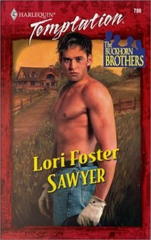
Coming in second was Sawyer – the cover depicting what looks like the head of a junior high student grafted onto a man’s body. Many readers who voted for Sawyer and Lucky mentioned that they had a hard time choosing between the two, and as was the case with Lucky many readers were all the more irritated about the cover because they had enjoyed the book. Here’s what voters had to say:
Suzanne: “Every criticism of this ‘jailbait cheesecake’ cover is justified.”
Sherri: “His head looks glued on after the fact. I feel sorry for the author.”
Valery: This was close – between Sawyer and No Strings Attached. Something about those baby faces sitting atop the over-developed shirtless bodies gives me a vague feeling of cradle-snatching, or that I’m looking at science experiments gone terribly wrong!
Third place was Ascendant Sun, with its oddly drawn people who reminded more than one reader of a bad seventies comic book. The most popular adjective voters used for this cover was “cheesy.”
Christine objected to the “weird facial expressions.”
One anonymous reader asked, “What is this man doing, and why is he painted gold?”
Ellen also noticed the gold paint: “The man looks as if he has a bad case of constipation. Maybe it was caused by that gold paint he was dipped in! Get him some Ex-Lax!”
And Ruby said,” he looks as though he’s waiting for the heroine to look away so he can stop holding in his stomach.”

Tor
Jacket art by Julie Bell
Jacket design by Carol Russo Design

Neighborhood Press
Cover artist: Unknown
The fourth place choice was Black Widow. This is a book I personally thought was quite good, and certainly undeserving of the horrible cover it received. The good (?) news about this poor cover is that the book is published by a small press, so most people ordered it online and didn’t have to look at the cover until it came in the mail. Voters who chose this one were completely confused as to what the figures on the cover were supposed to represent, but they all agreed that it was ugly.
From AAR’s Maria K: “Black Widow wins because I figure the being on the cover must be the missing link between man and ape.”
From Mary: “Black Widow’s cover wins for sheer absurdity. I don’t know what the book is about, but it appears to involve a gnome running through a jungle.”
From Julie: “I might need my glasses, but the little munchkin warrior running through the scene is beyond silly. It was good for a laugh! ”
And from Persephone: “What’s that thing in the background? It looks like a toad!!!”

Avid Press
Cover artist: Unknown
Coming in fifth place was the very poorly rendered Shadows of Love. I think from an artistic standpoint, there’s no question that this is the most amateur looking cover.
Dana found the poses stilted, and called it “badly rendered.”
Coverballot’s Lisa had this to say: ” Shadows of Love is the hands down winner here. Not only is the artwork awkward but the execution of it is poor as well. Then there is that lovely idea of putting a cemetery on the wharf right next to the Titanic with the lovely couple standing in the water.”
This was also the choice of AAR’s Marianne and Coming Attractions Editor Bessie Markis – both of whom expressed the desire to vote for “all of the above.”

Dell
Cover artist: Unknown
Devil’s Wager was the sixth place cover. With its odd pose and horse rearing in the background, it seemed to represent the worst in romance cover clichés. It reminded Patricia of “a badly posed co-ed cheerleading competition.” Several other voters described its horrors in eloquent and funny terms:
From Jocelyn: “Oh, God! They’re all horrible, but this one is by far the worst. He looks like he’s staring in horror at a cockroach; she apparently has no concerns about the fact that the horse is about to trample her beloved, and the horse is obviously terrified, yet easily restrained by one careless hand upon its reins. Amazing!”
From Tanya: “I pick Devil’s Wager, because I had thought we were past the gynecological exam phase of romance covers. Guess not!”
From Jen: “She’s sitting on his lap, barefoot, dress hiked up, holding the reins of a rearing horse without any effort! Unattractive *and* impossible!”

Love Spell
Cover artist: Judy York
Coming in at number seven was No Strings Attached, which pictures a photographer who seems to have forgotten his shirt (an all-too-frequent oversight in the romance cover world). Heather made this her choice, commenting, “Can you say oily bohunk?” AAR’s Teresa also voted for this one. She said “No Strings is the worst IMO, but only because the guy looks like he’s two bricks short of a load, if you know what I mean.”

Love Spell
Cover artist: Judy York
Against His Will was eighth place, and more than one voter said they actually liked it. One anonymous reader had quite a bit to say about it, however: “The Against His Will cover is just plain awful. My respects to DeSalvo fans. Forget the hero, the heroine looks like the reincarnation of the Wicked Witch of the West. You know, ‘Welcome, my lovely. I’ve been waiting for you’! For Cathy, the cover defied words; all she could think was, “What the hell?!?”

Sonnet
Cover artist: Unknown
Ninth place was The Quest, which most readers thought was bad, but not as bad as the others. Joyce thought it was “an ugly cover for what should have been beautiful,” and Anita said, “the art work looks like a painting of a paper doll.”

Leisure
Cover artist: Steve Aessel
High Intensity came in last – which in this category is a good thing. <g> This was another cover that several readers found attractive, and therefore thought it didn’t belong in this category. There were still those who found it the least attractive cover of the bunch, including Shawn, who said, “It brought back bad memories of the skanky pervert that haunted the jacuzzi at a hotel I stayed at once – GAG!” Vanessa who was also repulsed, said, “It’s a good thing he’s already in the bath. He looks pretty slimy!
While many readers found these covers funny, at least one felt angry after looking at such shoddy artwork. Michelle is one such reader, and she places the blame squarely at the feet of the publishers: “Publishers – are you all paying attention here: Just because yours isn’t the ‘winner’ of the worst category, be aware, we readers — those who BUY your product–have noticed how poorly YOU are marketing YOUR product! It tells us you don’t care about your books and your authors! Now what kind of message is that to send to your consumer?” Perhaps we can all hope that the publishing houses do better by these authors next time around!

To the Series Results

To our Concluding Remarks
![]() To the Page of Winners
To the Page of Winners![]() Submit a nomination for the 2001 cover contest
Submit a nomination for the 2001 cover contest