![]()
Committee Chair: Mary Lynne Nielsen

[fusion_separator style_type=”single solid” top_margin=”20″ bottom_margin=”30″ sep_color=”” border_size=”” icon=”” icon_circle=”” icon_circle_color=”” width=”” alignment=”center” class=”” id=””/]The Single Cover Historical category has traditionally been one of the strongest, with many nominations and interesting covers to choose from. Mary Lynne Nielsen, the SCH chair, shares these interesting observations about her category:
Looking at our slate, I noticed several trends:
- A dominance of people over landscapes. That’s not necessarily a bad thing, since landscapes aren’t as common in the SCH category compared to the contemporary category.
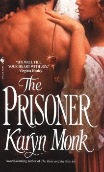
- A lot of woman-only covers. Only three of our covers feature couples, and one of them, The Prisoner, shows the couple obliquely. A whopping six of the ten covers feature women alone.
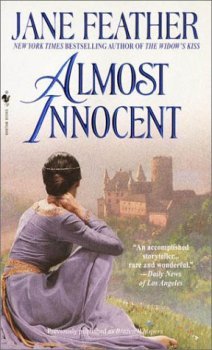
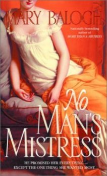
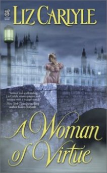
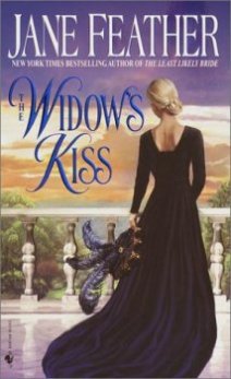
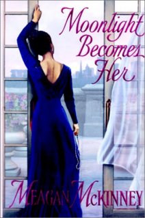
- Interestingly, all of these women are never actually fully depicted. In A Woman of Virtue, she’s obscured, and looking away from us. We see the backs of the women on The Widow’s Kiss, Almost Innocent, and Moonlight Becomes Her, a trend we first noticed last year. We see side profiles on Slighly Shady and The Prisoner, and in both cases the heads aren’t shown in full. The head of the woman is also partially shown in No Man’s Mistress. But we don’t have one cover that shows the clean, straightforward image of a woman facing us.
- There are no men-only covers, which is a relatively recent trend over the past several years. Men can be found a-plenty in other categories, but they are missing in this year’s single cover historicals.
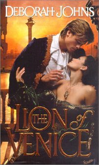
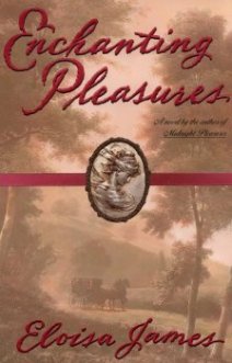
- Enchanting Pleasures is the only cover with that doesn’t feature people. At the opposite end of the spectrum, only two covers that remotely resemble the traditional clinch made it onto the ballot, and in both instances, received fewer votes than the other covers.
- Almost all of the art is lush, with lots of detail, levels, background, and a depth in color. The most different cover, artistically, is Moonlight Becomes Her, with its straight lines and somewhat flat look compared to the depth in the other covers. (I find it really interesting that Alan Ayers did this cover when he did other, more rich covers as well.)
- Five of our nominated covers were hardback publications. One of the four paperback covers was actually a reprint for a well-established, best-selling author (Jane Feather). This may show that the-powers-that-be in publishing are willing to spend more on better art for authors who are getting that big hardback push. Despite this, the top choice of the coverballot committee (but not the overall winner of the contest) was A Woman of Virtue, which appeared as an original paperback.
Bantam
Cover artist: Alan Ayers
The winner by a substantial margin was Almost Innocent. Readers described it serene, dreamy, beautiful, misty, and romantic.
Caseyanna simply loved it: “Hands down, the best of the best in this category was Jane Feather’s Almost Innocent. The colors, the dreamy castle and the model’s costume were all perfect. This cover just said ‘Ahh, romance…’ to me.”
It was Jennifer’s top choice as well: “Beautiful. A grown woman, ready to face the world, gazing one last time upon the dreams of her childhood.”
Zebra
Cover artist: Franco Accornero
In second place was No Man’s Mistress. Those who voted for it were attracted to its classic feel, and appreciated the fact that it looked like a real nineteenth century portrait. Several, like AAR’s Jennifer S., liked that it looked more like literature than romance. Here’s what she had to say: “It doesn’t look like a romance novel. Instead it looks like something found in the literary section. Very subtle.”
It also captured Stephanie’s vote: “Enchanting Pleasures was a close second, but the independent stance of the female on the cover of No Mans Mistress was the determining factor. That she was headless was jarring in a good way, as it increased curiosity about the scene rather than presenting something completely packaged and pre-digested. I quite like the movement away from very specific character covers and towards ambiguity – it adds a mystery to the story, rather than the overt lust scenes.”
Reader Susan had these thoughts to share: “I chose No Man’s Mistress because I like the way it echoes the portraiture of that period. Very classical, very classy, but the revealing dress and the sensual red and orange background colors hint at the heroine’s tarnished past.”
It got my vote as well, for all the aforementioned reasons.
Dell
Painting: Madame Recamier by F.
Gerard; Jacket Design by Lynn
Andreozzi
Bantam
Cover artist: Franco Accornero
The third place cover was The Prisoner. Voters who chose this one found the pose of the hero and heroine mysterious and alluring.
Lodeen thought it was “terrific,” and Kerry, who was wavering between The Prisoner and The Widow’s Kiss, ended up choosing The Prisoner because it caught her eye right off the bat.
A Woman of Virtue, the top pick of the coverballot committee, came in fourth. This is another cover that inspired eloquent comments from its voters, who thought it was beautiful – and couldn’t help but wonder why that woman was on the bridge at night!
Author Kathleen found it “tasteful and beautiful, ” and AAR Editor Jennifer admitted that she fell in love with it the minute she saw it.
It was the top choice of SCH cover head Mary Lynne as well: “I love the sense of mystery in this cover; I want to know why this woman is out there in that lonely place at night. The cover definitely made me pick up the book!”
Reader Kimberly also found this cover very effective: “ very evocative. Why is a woman of virtue out by a river at night? And who is she looking at? I definitely want to read the book without even seeing the back copy.”
Sonnet
Cover artist: Phil Heffernan
Dell
Book design: Virginia Norey
In fifth place was Enchanting Pleasures, which attracted voters with it’s elegant style and cameo.
Jennifer found it “elegant and classical; very tasteful.” Sherry loved the cameo and “the faded look of the painting.”
Laura had this lyrical praise: “The name of the book says it all – this cover is indeed an enchanting pleasure. Reminds me of how mist smoothes out everything early in the morning.”
In sixth place was The Widow’s Kiss, another Jane Feather title (which probably suffered somewhat in the voting because it was compared with the more popular Almost Innocent).
Sarah is one reader who made TWK her choice, but she had quite a time choosing: “Almost Innocent and The Widow’s Kiss are breathtaking – no face supplied so I can imagine her features, and just plain magnificent backdrops to the women posed on the cover. If I have to pick one… I’m going with The Widow’s Kiss. Ask me tomorrow and I’ll change my mind!”
It was reader Jeni’s choice as well. She liked the cover so much, she bought the book. She said, “While I was engrossed in the story, I just had to interrupt my reading to look at the cover over and over. And I normally don’t do that either!”
Bantam
Cover artist: Alan Ayers
Kensington
Jacket art: Alan Ayers / Jacket design: Sophia Duffy
Coming in seventh and eighth were Moonlight Becomes Her and Slightly Shady, more “female back” covers.
Linda and Patti both chose Slightly Shady because they felt that the artwork reflected the title.
Suzanne made SS her choice as well: “The cover piques my interest, raises a lot of questions about this woman that I hope will be answered in the story.”

Bantam Doubleday Dell
Cover artist: Alan Ayers
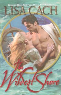
Leisure
Cover artist: John Ennis
The ninth and tenth choices were the two clinch covers, The Wildest Shore and The Lion of Venice. While clinch poses are unpopular with many, both these covers had some eloquent fans.
Several who chose The Wildest Shore commented on the hero’s attractive chest. Rebecca seemed to speak for many when she said, “It’s the abs…definitely the abs!”
Those who chose TLOV commented on the romantic pose and rich color scheme. Shelly said, “This was the only cover that really drew me. The rich color scheme was exciting and intriguing.” It was also Malvina’s choice: “With just a hint of background, this cover shows a significant, romantic ‘look’ between hero and heroine. Lovely.”

To the Winners/Intro Page

To the Historical with Stepback Results
![]() Return to Winners/Intro Page
Return to Winners/Intro Page
![]() Comment on our Potpourri Message Board
Comment on our Potpourri Message Board
![]() Submit a nomination for the 2002 cover contest
Submit a nomination for the 2002 cover contest
The cover controversy AAR Home