Continued from previous page
About the Worst
I cannot hope to equal the voters’ comments on this category. I’d be tempted to tame them down too much. To say they got hot under their collars over these six covers would be to grossly understate the matter. While a much-beloved Regency Romance author pouted, “It’s not fair to limit the choice to only one!”, limit we did.
Reader Cheryl managed to summarize most voters’ comments in this category by saying:
“”I had no trouble making a decision in any category except this one. They are all so terrible, can we have a six-way tie? I mean really! The Neanderthal in the Viking helmet; the androgynous couple in the Cocoon swimming pool; the deer-in-the-headlights gunslinger, [etc.,]. How did that ugly man with his “duh” expression get approved for poor Eileen’s cover (Never Trust A Rake)? And what’s with the beefed-up Ted Danson look-alike (My Lord Destiny)? ‘I’m going to the coast, it’ll be windy, I need my cape. What’s that? Where’s my shirt? I don’ need no stinkin’ shirt!’ But I have to vote for the last one, the Jolly Viking. He’s the only one that makes me want to smack him. Waggle that finger at me, will you? Yeah, waggle this, babe!”
A well-known historical romance had this to say about all the “worst” nominees, “My Gawd! They’re all hideous! The models look deformed and the bull’s horns are hysterical. Yeah, I’d read a book on a bus where the guy on the cover is giving the old lady across the aisle from you the finger. Sheesh. The muddy brown abortion (Seekers of the Dawn) has to beat them all, though. What the hell was the publisher thinking?? Romance in a flowing sewer main?”
Of these hated covers, three were more hated than the others. As you might have gathered from the comments above, the covers that received the most vehement negative responses, in order, were Seekers Of The Dawn, Beloved Warrior and Bewitched Viking. I’m sure you’ll agree that “hate” is not too strong a word after reading more of our voters’ comments.
At the outset, I should say that not everyone who voted thought it was a good idea to have a “worst” category. While most who voted understand that this category is a way to express their displeasure to the publishers, some readers, and at least one author, who “didn’t think any of them were that bad,” wrote us that, “I choose not to vote in this category, because I don’t know who might be hurt by it. Hurting an author, who is already upset over a bad cover would kill me.”
However, as you’ll discover below, some of these covers are bad enough to prevent readers from buying the books altogether. Surely publishers need to know that they are hurting sales with some of these horrendous choices.
Seekers of the Dawn “won” as worst cover by a hair. This is an electronic book, and our publisher had qualms about even including an e-book in the “worst” category because, budget-wise, these new publishers cannot compete with print publishers. But, bad is bad. And here are some more of the comments we received about Seekers of the Dawn:
- Genia wrote, “They look like embracing corpses!”
- For Shanda, the issue was hair. She wrote, “These poor people look like they have feathers instead of hair!”
- Isobel thought the characters depicted on the cover looked “like ghosts,” adding, “at least the other covers depicted 3-dimensional people.”
- For Sue, the characters depicted “look like extras from a George Romero movie.”
- More than one voter posed Ann’s question: “Which one is the man?”
- This cover made Marianne “long for the days when Fabio” was on the cover.
- And Carla, who would have chosen any cover as “worst” with Fabio on it, now has a new benchmark to measure bad against.
size=4> 
New Concepts,
Eliza Black
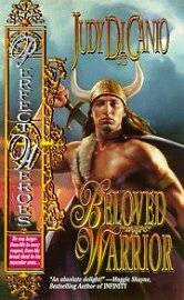
Our voters really don’t have a bias against Viking Romances, but the covers they hated nearly as much as Seekers of the Dawn are Beloved Warrior and Bewitched Viking.
LoveSpell,
no art creditAbout the cover with the 2nd highest number of votes, Beloved Warrior, we heard the following:
- Linda likes the author and found the book not bad, but of the cover, wrote, “he looks like the closest he ever got to Norway was to Sicily. . . the cover was truly hideous.”
- At first glance, Rita thought the cover had “been done for a joke.” She would “never buy this book.”
- Michelle echoed that sentiment with her comment: “No money in the world would ever get me to buy Beloved Warrior”
- So too said Angie, who “wouldn’t be caught dead with that cover” in her shopping cart.”
In third place came Bewitched Viking, about which we received many comments. Here are the highlights:
- From artist Patricia: “He’s smirking! It’s awful! It’s like he’s saying, ‘C’mere, little girl, I have some candy for you.’ ”
- Licia thought the Viking looked “as if he were flipping you off.” Her “immediate mental response/rewrite was, My Lord A__hole. How romantic is that?”
- Maureen found that “no other cover evoked such a feeling of annoyance than that man with his finger stuck up like that!”
- VL found the effect of the cover more comical than sensual. She wrote, “When a cover makes you laugh, you can bet that’s not the effect they are going for. Are the people who designed these covers all high?”
size=4> 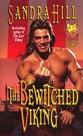
LoveSpell,
John Ennis
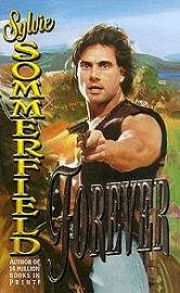
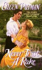
Coming in as the “B” list of worst covers, in order, were Forever, Never Trust A Rake and My Lord Destiny. Some voters actually liked the one in last place, My Lord Destiny, but it too had its fervid detractors.
Leisure,
no art creditEveryone who voted for the fourth-place Forever cover as “worst,” mentions the pointed gun as what they find most offensive on a romance cover. Here are some of the specific comments:
- An up-and-coming Regency Romance author wrote, “It’s a tough choice, but I guess the crazed gunman aiming for the potential customer is probably the worst idea ever.”
- JoAnn would “much rather have a finger or horns pointed at me than a gun.”
- For reader Vy, looking at this cover was “possibly the most I’ve laughed with a book without reading it.”
Avon,
No art credit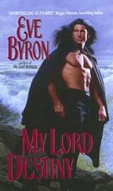
Avon,
no art creditOur fifth place finisher inspired these comments, among others:
- Sharon remembers “not buying this book because of the cover.”
- Kira wrote that “He looks ready to breast feed (and) is definitely a candidate for Kramer’s ‘Bro’ bra (or manssiere for other Seinfeld afficianados).
My Lord Destiny received the fewest votes as “worst” cover. A few voters even wrote in to ask why it was included in the “worst” category. Although our publisher agrees with the assessment that the man looks like “Ted Danson on steroids,” some readers found this a dark, moody, and sexy cover.
I have a suggestion to make to the artists and to the publishers. I do not think that you are showing these covers to enough women who read and buy romance novels. Each of these covers touched a hair trigger among the women readers. The women are very specific about exactly what they found offensive. I’m not sure these aspects would occur to a man. Many of these covers strike me as what a man might imagine a woman would find attractive. This is probably as flawed an idea as asking a woman what a man is going to find attractive in another woman. The whole world would be more easily married if each sex could really assess the other that effectively.
I must agree with the voters about all six covers. I never picked up a single one of them and never read the blurb of any of their story lines. I certainly saw these on the bookshelves but quickly passed them by. My vote is for My Lord Destiny because I don’t like anything about the man depicted: his hair, his facial features, his pumped-up build, his expression, his lack of shirt, his cape and the fact that no one would dress like this for standing on a cliff. Most telling of all, I bought not a single book out of the six, not even the discounted or used copies of them I saw for sale.
Looking Ahead
We’ve already begun work on covers produced for year 2000 releases. We’ve set up a ballot which will stay online throughout the year. If you find a cover you love, or a cover you hate, go to the ballot, fill it out, and send it in.
— Carol Irvinwith technical assistance from Sandi Morris
color>
![]()
![]() Return to previous page
Return to previous page![]() Continue this discussion on our Potpourri Message Board
Continue this discussion on our Potpourri Message Board
