More Than the Clinch: An Interview with Romance Cover Artist James Griffin

If you’re a romance reader, chances are you’ve encountered James Griffin’s art. He’s been creating artwork for romance novels for an astounding 45 years, and he brings to his work an enthusiasm and energy that’s infectious. Griffin studied art at the Pratt Institute and was living the “young starving artist” life in New York City when a friend mentioned that he should consider book-cover artwork. The rest, as they say, is history.
Griffin has produced material for every major publisher in the romance business, creating art for literally thousands of covers and stepbacks for romance novels. While historical romance is his specialty, Griffin has illustrated other book genres like mysteries. He also has a substantial presence in the fine-art world. Griffin grew up in various locations around the globe, and his art reflects the many places he’s lived.
When I looked for information about James Griffin’s contributions to romance, I was surprised to realize that there was no interview with him about his experiences creating romance-novel covers. Griffin has lived through the transition of cover art from physical to digital along with the transition of books from paper-only to ebooks, so he has a unique perspective on the romance business. This interview, conducted via email in July 2021, gives you a glimpse not only into the process by which romance art comes into being, but also into the insights and aspects that Griffin has contributed to the genre.
I think my favorite part of Griffin’s approach to romance is the respect he has for romance, not only for the books but for the actors (his preferred term compared to models) who stage the scenes that Griffin and others use to create their art. I always say that a cover has one job—to make you pick up that book, either literally or virtually, and read more. Griffin has clearly convinced many romance readers to do just that.
What’s the most exciting thing about creating romance novel covers?
I love taking the suggested idea and turning it into art. I always try to do something innovative and fresh for the cover, and that process of constant renewal keeps the whole thing exciting.
How did you get started working on romance novel covers and stepbacks?

I did my first romance cover in 1976, working for a small publisher, Ace Books. At that time, the stepback did not exist. This was the end of the “Gothic Romance,” at least as it was being done then. When I began getting a lot of work, I noticed that all the art directors were men and they approached the cover from a man’s point of view, namely showing as much skin on the woman and relegating the man to “prop” status. Being a guy, I too liked making the woman as sexy as possible, but I also started to feature the man more prominently, creating the famous “falling-off-shirt.”
I began to realize that the more important aspect for a woman’s book was love, not sex. The covers were still sexy, but the emphasis in my work at least, was on heartfelt interest between the couple. Sometimes the covers became almost too wild for the public. I remember being on the subway and noticing women reading romance books, to which they had added brown-paper covers! The publishers also saw this and created the stepback, whose concept was to have an alluring but somewhat chaste front cover, which opened to reveal the raging love scene, discreetly hidden.
What parts of the cover do you get to determine? What parts are set for you by the publisher?
When I first started in book covers, the publisher would hand me a box with a copy of the unedited manuscript inside. After the project was finished, I used the back of the pages for shopping lists. It made for interesting reading in the supermarket checkout line! The point is, I was the one who decided what was going to go on the cover. It suited me just fine, but the publishers began to take more control over what scene went on the cover. Now, I only receive a page with a few facts, hair color, and the thinnest synopsis you could imagine.
How much guidance or instruction on art style, design, or direction do you receive from the publisher?
Usually the art director, author, and editor all know my style, so they just let me do my thing. I always do a sketch before the shoot, so they can see what the finished cover will look like. In my first twenty years or so, I would create small paintings that the art directors would comment on. “More space at the top!” was the usual comment. That was when they could catch anything that was not working for them.
Nowadays, the team decides what should be on the cover, where the title will go, and the general feeling of the image. I still manage to put my stylistic stamp on the art, but within narrower boundaries.

Do you receive the book to read ahead of the shoot? Do you receive a synopsis?
I read a one- or two-paragraph synopsis, a short statement of period, clothing style, setting, and what the relevant action is. It must be experience, but I can look at these scraps of information and get a design in my mind. I intuitively seem to know what would make an interesting cover. When I work with an art director for a long time, we get to understand each other and, more importantly, he or she trusts that I will do a great job. That being said, when I create sketches, I usually do one that I think is what they had in mind, one that is a variation of the first, and then one where I let myself play and experiment. I don’t really expect them to choose the latter one, but sometimes they do.
On the bookshelves, covers are competing with one another and if they all look similar, it’s not good for sales. A really different cover, however, can grab a reader’s attention and make them pick up the book. If that cover is different enough and beautiful at the same time, the likelihood of the reader buying it increases a lot.
Do you get to work with the author on your covers, or is it just through the publisher?
I do get requests from the author, sometimes they do their own mockup. This is generally not a good thing, but it can work out. It helps if the author has a background in the arts; otherwise, what I receive from them is a laundry list of half the things in the book, all jammed onto the cover. I know right then and there, I can’t do a cover like that. It’s bad design, to include too many elements on the cover, and usually less is more.
Do you select cover models for your shoots?
Yes, I do. The models are an important part of the book cover, and we often get to know each other after working together many times. To call them models is actually not the word I would use for them. The best ones are actors. I have worked with many actors who are older than your typical fashion model. Some of them have kids, and they enjoy getting away from the normal world for a bit of fantasy with a hunky guy. I would rather have someone who can show emotion convincingly than a pretty face who doesn’t know how to act.
How do you find the costumes and props for your cover shoots?
 Over the years, I have researched and come to know what people would wear in each decade from the 1700s to the twentieth century. I have had to learn about medieval and renaissance clothing, Roman soldiers, Indians, cowboys, and so many more. I used to have a collection of my own, but most of the time I use the services of a former illustrator turned “Costume Lady,” Sharon Spiak.
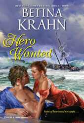
Costumes are very important to the project. I have seen actors “become” the part when they put on a period costume. Of course, I have to be able to make alterations in my painting. As for props, they come from research and then are often made up from studying drawings and photos. The photo shoot is a pretty bare-bones affair, with minimal props and very often someone lifting the corner of a dress to simulate wind. On a recent cover, Hero Wanted by Bettina Krahn, the couple was supposed to be soaked from a shipwreck. They weren’t. Because of decades of painting experience, I knew how to paint them in wet clothing.
Take us through a typical cover shoot. What happens?
The first step is the sketch, which is approved by the powers that be, then the shoot is set up, along with costumes and model choices.
I note the lighting on my sketch, along with what the mood and action should be. We are allotted only an hour for the shoot because of budgets, so I am super-ready. Once the lighting is set up and the camera angle is decided, time seems to stand still. It’s amazing what can be squeezed into an hour!
I act as the director when I’m there or sometimes I am in close contact with the photographer, Shirley Green, and she directs.
I get them into their pose, which is the beginning idea. Often what happens in the studio is better than my idea, so we go with it. I always make sure we have covered the things the art director asked for. It is intense!
How do you determine the backgrounds you create? Is this based on the cover model shoot, or something else?
I always have a background in mind and a foreground, too. If it’s got good lighting in the reference photo, I will use that lighting in the shoot. In the case of Hero Wanted, I had to come up with a ship from the correct era and then “wreck” it on a reef. Wild waves and stormy skies are a specialty of mine, so that was enjoyable, but the sky, the water, the beach, and the couple, soggy in the surf, all have to work together.
What happens after the shoot, to move from an image to the final art composition?
In the days of painted covers, up until the mid 1990s, I would use the black-and-white photos to draw up the canvas. After that it was a matter of pure painting in oils. It would take me 3-5 days to complete the painting. Then I sent it to my agents, who brought it over to the publishers.
Now, the computer is what I paint book covers on. Using a tablet and “brush,” I paint and blend the different parts of the image In Photoshop. I can have as many as thirty layers during the process.

Were there differences in working for different romance publishers?
Yes, there were different personalities, and corporate people at the upper echelon had their influence. Some art directors were so worried and almost scared, so they would micro-manage me. I stopped working for directors like that as soon as possible. They all had the same intention, and that was selling books. The romance genre kept many of the publishers afloat.
Do you have any say in terms of fonts used on covers?
I leave that up to the publishers. Even if I wanted to, they have their own approach, so why cause trouble?
What’s your preferred medium for creating cover art?
I have to say, I love the old-fashioned painted cover, even though I have not done more than a handful in the past twenty years. I just love to paint!
How have the methods for creating cover art and stepbacks evolved over the years?
The computer is the biggest change. I was at the top of the market in the 1990s when my agent sat me down and told me that computer art was the thing everyone wanted. My painted covers were starting to look “old fashioned”! After going through the nine stages of grief, I learned drawing on the computer. I actually liked it a lot and it broadened my horizons.
How have you seen the romance covers themselves evolve over the years you’ve worked on them?
I could write a book on that one! I didn’t want to paint covers the way they looked when I first started. They were cheap, shoddy things, slapped together with paper that yellowed. I began using my fine-art background to give the cover a feeling of integrity. The covers started looking beautiful and the publishers began to use better paper. Over the decades, the cover became one of the most important aspects of a romance book, particularly when the author wasn’t well known.

What was the first cover you ever created? What was the latest?
The first cover was a book set in the eighteenth century and painted in beautiful, old-master colors. I can’t remember the name now, but it became part of a series, as so often happens. Within a year, I was working on three different series.
The most recent cover I created was White Knight Needed by Betina Krahn, which will be published in 2022.
Do you have some covers or stepbacks that you’re particularly proud of, and why?
One of my favorites from the painted cover days was Diva. I don’t know who the author was, but it was a beautiful, experimental design, with swirling scenes of Vienna and a portrait of a lovely lady in an 1890s opera gown
If I asked you for your “James Griffin Top 10,” as a representation to share with new romance readers of what your cover art is like, what would those covers or stepbacks be?
Eloisa James, A Kiss at Midnight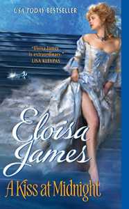
Eloisa James, When Beauty Tamed the Beast
Eloisa James, An Affair Before Christmas

Gaelen Foley, My Wicked Marquess
Jennifer Blake, Midnight Waltz
Eloisa James, A Duke of Her Own
Lorretta Chase, Silk Is for Seduction
Sophie Jordan, Sins of a Wicked Duke
Sophie Jordan, How to Lose a Bride in One Night
Have you done a series of books for a particular author? If so, how do you build both unifying and distinctive elements for those covers?
I have done countless series for a particular author. I like it best when there is a continuum that I can build on.
How many covers do you create in a typical year?
I am semi-retired from illustration now, although I still do the occasional project. In my best years, I was creating eight covers a month.
What about “clinch” covers? Do you like creating those? Do you prefer something more sedate?
I like doing clinch covers, but the chemistry in the shoot has to work very well. The hardest thing is to create a convincing love scene when one of the two people isn’t really into it.

What are the differences in creating covers for other genres, such as mysteries?
I love working on mysteries! The spooky light, the way the people get to act, inspires me to do some of my most innovative work. A recent series that I really enjoyed was by Cathy Pegau, mysteries set in Alaska in 1908-1920. It was a very original series and I responded with what I think are three exciting covers.
Do you share your cover artwork with those who look at your solo art catalog, or do you keep those environments separate?
I do keep my illustration work separate, even maintaining a website just for illustration, www.jamesgriffinillustration.com.
Is any of your romance cover artwork available for sale?
Some are, but mostly I sell prints. I have been wanting to do a large show with them, but so far haven’t found the right venue for it.
How can readers identify a James Griffin cover or stepback? Is there a unique way you sign them, or something else they can use?
I always sign my work, “Griffin” somewhere on the art. Sometimes it gets cropped out, but most of the time you can find it. Also check to see if it’s on my website. That site is not all-encompassing—I have created approximately 4000 illustrations. It’s hard to keep up.
Romance covers are a popular subject on Instagram, particularly with younger readers who are discovering romances published with stepback covers. What’s something you would love a younger reader to know about these covers?
That these covers were created by real artists, who put all kinds of care and work into them.
What’s a question that you wished someone would ask you about what you do, but they never do? And what’s the answer to it?
“Would you like to do a show at my gallery, museum or university?” My answer is a resounding “Yes!”
So there you have it—a picture of how romance covers and stepbacks are produced by one of the masters in the field! (I have to admit, as a reader, it’s tough knowing that Griffin used draft manuscripts for grocery lists. J I can imagine what popular-culture libraries might think of that!)
I want to thank Griffin for his gracious willingness to conduct this interview. If you’d like to explore Griffin’s cover art, visit jamesgriffinillustration.com. If you’d like to see his work in fine art, visit jamesgriffinstudio.com.
A list of some of the book covers and stepbacks Griffin has created can be found at this link. If you can identify other covers from his art that are not on this list, please let me know!
~ Mary Lynne Nielsen
I had a cover done by him for the Earl’s Forbidden Ward for the UK cover. The whole painting is lovely
I would so love to own an original. They’re so so gorgeous!
Super interesting interview! I loved hearing how the industry changed over time and recognized many of the covers. Thanks for the post!
Thank you so much for taking the time to share this, Manjari! I’m glad you enjoyed it!
Mary Lynne, thank you for the fascinating interview. As I am a newer romance reader, it was a pleasure to read about Mr. Griffin’s career and his process for creating his artwork. His covers are beautiful, and I have a new appreciation for all the thought that goes into them. And I knew nothing of stepback covers, and now I do, I will look for them.
First off, welcome to Romancelandia, Becky! We’re happy to have you here. Stepbacks are a fascinating part of romance cover art. Once you start looking for them, you’ll all sorts of great, sexy, and even amusing ones! Thank you for the kind words!
I love behind-the-scenes info and interviews, so thanks for the post! Mr. Griffin’s work is quite lovely.
It surely is. It was so interesting to discover the elements of what he did to make these stepback covers. It’s a loss to the industry that we don’t have them as much today.
Thank you for this article. I recognize a lot of those covers — because they stand out.
Romance cover artists often don’t get the credit they deserve, in part because the genre is mocked. If you ever get a chance to see the original cover art for a romance or an older Gothic romance, especially with a nice frame, it will look better than you realize. Some covers change in your mind if you see them without the author name, title, and cover blurbs.
I agree, and that’s part of the reason I wanted to do this interview! Artwork is a part of romance novel history that we need to capture. It’s amazing how many of us recall a book in our minds by its cover.
Thank you for highlighting a very interesting artist and his career. The interview format was fun to follow too.
I’ll be back to finish looking through all the links to the artwork.
Thank you, Kathy! Checking out his art helps you understand how much you know his art but may not realize it. :-)
Thank you so much for this doing this interview Mary Lynne! Mr.Griffin is so talented and what a great career to have for so many years.
I appreciate this kind comment! I felt as if his work should be known more. I hear Pino, Ayres, Duillo mentioned all the time, but not his name. He deserves the recognition!
Thank you for this wonderful interview! I went to the website and had so much fun. I touched some of the thumbnails to get the larger image, and noted at the bottom of each one he adds background on the art and shares sometimes humorous thoughts.
That’s fantastic! I know he’ll be thrilled that you checked out his work in detail!
This was wonderful! Thank you for posting it. Like Mr. Griffin I loved the “older style” painted covers as well. I really think one of the reasons I ended up with so many Barbara Cartland novels back in the day was because I loved the art work on many of them.
Mr. Griffin has an impressive body of work over the years. I hope he gets his show at a gallery one of these days. I’d love to see it.
Oooooooh. I did love Bab’s covers. They were so seductively winsome.
I’d love to see a gallery show of some of the amazing romance cover art that’s been created over the years. And Griffin is impressive, isn’t he? Thank you for the kind words!
This is so cool – James is super talented!
Yes, he is–and worthy of recognition!
Slightly o/t, but a few years ago I read an interview with cover photographer Claudio Marinesco and he said he’s seen models who meet on a cover shoot, leave the shoot together, and start dating. I’ve always thought there was romance novel waiting to be written there. Lol
I completely agree–what a way to start!
Great interview. I haven’t had a chance to do more than skim the illustration gallery, but did notice some I’ve never seen for a few of Mary Stewart’s romantic suspense novels. How cool!
Yes, those are really interesting, aren’t they? I noticed them in terms of the art seeming to be related to one another, and then realized they were all for Stewart’s books! Thank you!
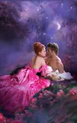
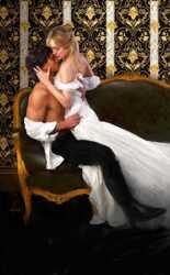
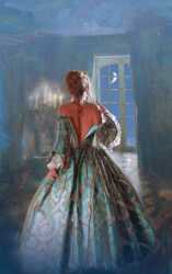
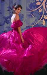
He’s certainly done a lot of luscious and memorable covers. On the “header” pictures, I guessed When Beauty Tames the Beast as #1 and thought I had #4 and #6 as Chase and James. But I had those mixed up – they’re James and Chase. Who knows the rest?
Well, obviously, I do know them all as I put the post together, BUT I did recognise #3 as the stepback for Lorraine Heath’s Once More My Darling Rogue before I looked at the name of it!
Thank you for all your hard work on this, Caz! Appreciate it!
I don’t know them all–even James doesn’t know them all (and I asked him!). There is a list on my website of the works I could identify. If you know more, please LMK!
Wait–I realized you’re asking about the order up top. :-) #1 is the art for When Beauty Tamed the Beast by Eloisa James; #2 is Borrowing Death by Cathy Pegau; #3 is Once More, My Darling Rogue by Lorraine Heath; #4 is A Duke of Her Own by Eloisa James; #5 is Scandal in Spring by Lisa Kleypas, and #6 is Silk Is for Seduction by Loretta Chase.
Yes – those are the ones I put under the spoiler tag :)
A great interview—thank you for posting it. I loved the part about using the pages of a manuscript for grocery lists! I remember the beautiful cover for Jennifer Blake’s MIDNIGHT WALTZ (which, sadly, is not the cover now being used—so don’t bother checking it out on Amazon). I suspect Griffin must have done the cover art for a number of Blake’s mid-to-late 1980s books because they all had lovely, lush covers.
Hah – I did actually check that one as it wasn’t among the images I was sent!
Yeah—the cover they’re currently using is fairly run-of-the-mill and is attributed to “LFD Designs for Authors” on the copyright page. There are two other versions of the cover shown at Amazon (including one for the French language edition of the book), but none of them resemble what I remember of the original cover. (Incidentally, MIDNIGHT WALTZ was a good story—but it is set on an ante-bellum plantation, with commensurate attitudes toward the enslaved population, and there are some very problematic consent issues because the heroine thinks she’s in bed with her husband when she isn’t. This is probably why it’s best not to reread favorites from 35 years ago.)
I love looking at some of these older illustrations. Some of the Goodreads librarians have done a good job adding them. You can find the old Midnight Waltz cover and stepback on there:

That’s right! There’s a key plot point that occurs during a hurricane on Grand Isle in Louisiana. It is the French language cover (or very similar). Thank you!
Sometimes Griffin himself doesn’t know what a particular piece of art was for. So his labels can be misleading! But this is a lovely piece of art. Thank you for the kind words!
Very interesting to read about the behind-the-scenes prep work for cover art. Far more goes into it than one would think. Thanks to the reviewer and Mr Griffin.
Thank you for saying this! I was so grateful he was willing to address the many questions I asked!
This was great! Very interesting, and nice covers, hardly ever see those anymore now that I read only e-books. Well, not the step-backs in any case.
Yes, stepbacks are a rarity today. What’s interesting is that a younger generation of romance readers is discovering and loving them. Thank you for sharing your enjoyment!
Gosh, what an interesting interview.
Looking through the artist’s online gallery, I recognise quite a few of the covers. I’ve always thought that the worst thing about ebooks is that you don’t get the stepbacks, so those are very interesting.
I miss when these classy covers were the norm!
Thank you.
I looked through them too and was pleased to recognize them as well. They are GORGEOUS!
They really are. It’s what motivated me to reach out to him, and through conversation pursue the idea of an interview!
Thank you! I’m so glad to you found it interesting!